|
Update on Project Activities
As illustrated by our blog post from last week, we came in to this week feeling uneasy about the quantity of data that we have been able to collect thus far. We felt as if the quality of the data is high, but didn’t know if the low number of responses would somehow discredit that quality. Another insecurity that we were experiencing was that the data that we were receiving told a different story than we had originally anticipated. We had a brief meeting with Deland to express and work through some of these insecurities. She assured us that the work that we were doing would retain its impact and importance despite low response rate and that data points we had were indeed telling a story with heavy social implications. We also scheduled a meeting with Jason, our community partner for Thursday afternoon. Because of traffic accidents and similar addresses in neighboring towns, we were not able to meet up with Jason in person. Instead, we took this opportunity with the three us all being together and Jason being free to have a very productive conference call. We updated him on how data collection was going and expressed our opinions about changing what our end deliverables will look like. Our team has had similar thoughts about the fact that the data we are receiving isn’t best depicted by a map illustrating movement as we previously thought. Luckily he was open to the idea of changing the deliverable to best display our data. We had previously planned to be done with data collection last week, but we decided with Jason’s endorsement to carry out making calls in to the early parts of next week to get any last minute data points. What We Observed/Learned This week we learned just how much the formation of expectations and unconscious biases can shape the process and products of a project. Because we had set such clear expectations for the end products of this project, the fact that we are most likely not going to be able to meet those goals feels disappointing. However, we have decided that being flexible to our plan and tailoring the deliverables to best suit the needs of the data, emphasizes the authenticity of the information we are presenting. Ironically, this shift in the direction of the project is almost refreshing because it validates the importance of on-the-ground data collection and the fact that the only way to understand what a community is actually facing, apart from broad generalizations or predictions, is to ask those directly involved. It is easy for us, as outsiders, to impose our own opinions on to the situation and find “evidence” to support our claim, but when you let the people in the community dictate where the project is headed, you’re headed toward making a more significant social impact. Critical Analysis At the start of this project, our group was set on letting the data speak for itself, apart from personal narratives because that is what we believed would be most convincing to policymakers and local governments. However, because we have come to realize that our project has different implications that we first expected it to, we are beginning to understand the value of coupling raw data with the stories of the people that provided it. How you choose to present data is just as important as collecting it because the way that people interpret data is far from objective. This realization could promote stronger community engagement by emphasizing the human aspect of this project in putting faces to this cause. What we have been up to:
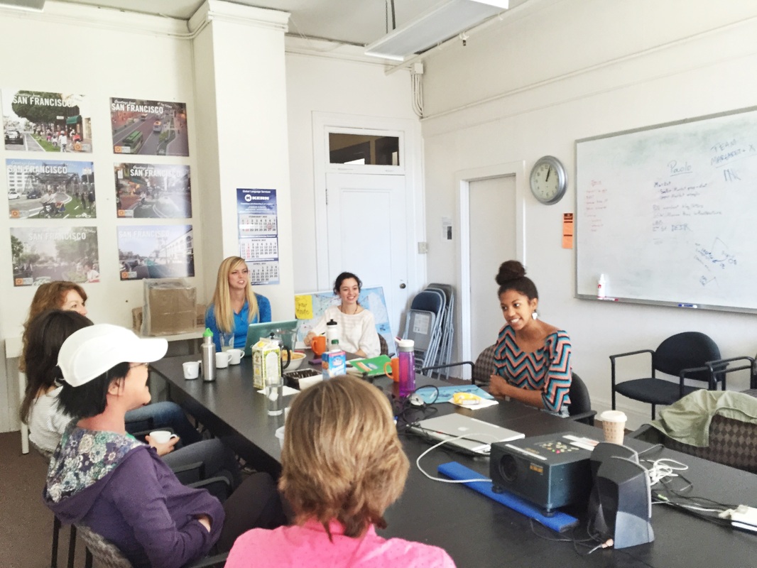
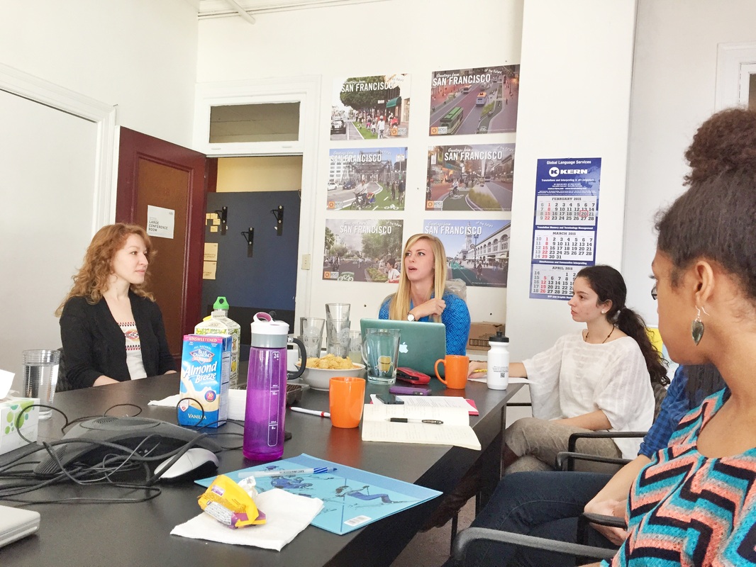
This week has been mostly receiving data from our survey through the San Francisco Bike Coalition (SFBC) and prepping for our trip to San Francisco. The survey for the SFBC was a huge success! We got about 400 responses, which represents a significant portion of :the women population that belongs to the SFBC. We have started reviewing the responses of the survey in order to pick out general themes from the responses. Other than the SFBC survey, we have also received some responses from The Women’s Building. Even though we didn’t get nearly the same amount of responses, these responses provided very unique perspectives from Women in San Francisco that don’t bike. The bulk of our work this week has been to prepare for our trip to the offices of the San Francisco Bicycle Coalition. We prepped question in order to guide the discussion with the participants. This Saturday we actually ran the focus groups, which consisted in two 90-minute sessions. The goals of our focus groups were to expand on some of the themes we noticed when reviewing the surveys and get feedback on some the branding we have developed. We had two 90 minute focus groups that included a variety of women. In the first focus group we had 3 women participate in our discussion and then we had 5 women (including our Professor) participate in the second group. The women who participated ranged quite widely in age (our oldest participant was in her 70s), most where young professionals, and some were moms. Our community partner, Janice Li, led the bulk of the focus group while we took detailed notes. At the end of our focus group we explained how their responses would help us develop our project and lead a discussion of some of our branding efforts. Our day with the SFBC ended with a discussion with our community partners about our plan for wrapping up our project in the coming weeks. What we have learned: Here we would like to present some of our main takeaways from the focus groups. Empowerment One of the most valuable takeaways from these focus groups was the women’s individual internal experience while biking, and the positive changes they felt in their identities and personalities after they began to bike around the city. The women often described a sense of freedom--as though all of San Francisco was suddenly unlocked and available to them for exploration and discovery. They talked about experiencing increased confidence and assertiveness after biking for a while--qualities that they carried into other areas of their lives. The women also discussed a sensation of strength. They feel physically capable, and generally stronger than they did before they started biking. All of these experiences are extremely important, and truly answer the question “why should we get more women on bikes.” Getting more women into an arena that is currently dominated by men opens the door to get them into even more arenas that are similarly male-heavy. The women are making their bodies and minds more resilient, and this is so critical in improving gender equality. Community Many women in both focus groups touched upon this idea of community. Some said they did not know a lot of women that they could bike with. They wished that biking could be the mechanism that brings like minded females together either through coffee chats, group rides, or some sort of social network. Us vs them mentality Several suggested one of the biggest barriers to getting more women on the road was concern for safety but more specifically the us vs. them mentality that has manifested in the dynamics between bikers and drivers. The women would like to see a shift in this negative culture that has erupted on the streets of San Francisco and likely many other places. Until that shift occurs, the women brought up something we have not thought about yet and that is to prepare by predicting what the cars are going to do. As you are biking, think about how cars drive and their predictable tendencies like stopping at lights and stop sign or turning and adjust your biking accordingly. This takes biking safety more into your hands. Better preparation for mentors Lastly, when the women were asked if they had ever attempted to get other women involved in biking, many said they were unsuccessful. It was for lack of trying or enthusiasm for biking in SF. However, they said it was more a difference of skill and they became intimidating to the people they were trying to encourage. This calls for preparing the women to be mentors. They need to learn to be aware of other’s level of biking and adjust their biking and teaching style to the beginner. They need to learn skills that suggest support rather than intimidation or being patronizing. This way it is a much more enjoyable time for the beginner and could encourage her to continue to bike. Our next steps: Branding: At the forum, we got the opportunity to show the women drafts of the logo we have been working on. The drafts had different color schemes and fonts, and after distributing the samples we opened up the floor for commentary on them. The women’s feedback was very helpful. We learned which color scheme they preferred and why, as well as whether or not they found the font to be readable enough. We also learned how they felt about the symbol we used, and what changes, if any, they thought needed to be made to make the logo more representative of the community and more appealing to the people we are trying to encourage to join. We found that women prefer the blue and orange color scheme the best, but that the font that we utilized primarily in the drafts can be a bit difficult to read. The women liked the symbol, although one participant felt that the graphic could be improved by adding overlapping spikes as opposed to ones that radiate from the center, each at their own angle. Next steps include developing a draft that incorporates this feedback, and giving it to Janice to be distributed to a wider audience for a second round of commentary. We also took the forum as an opportunity to distribute a short, informal survey regarding the gear/merchandise the women would be most interested in receiving. We asked them to rank their top choices, and out of a list that included over 10 possible items, stickers, water bottles, and totes were the most popular. We can use this information in designing this merchandise, and continuing the branding development. We also talked about creating copy that could be put on the SFBC website once they create a Women Bike SF section. This copy would include things like a mission statement, information about the work/outreach that the initiative is doing, and information about the importance of the initiative in the broader context of both biking and women’s empowerment. Surveys: We talked in depth with Janice about next steps for the survey that was distributed to the female SFBC members. We now have about 400 responses, and we felt it was important to learn exactly what information Janice wanted to get out of the data, and how she wanted it presented to her afterward. For some of the more open ended questions, we plan to create informative categories based on the responses we are seeing, and then to rank them in terms of the number of times they came up. Other information, such as that relating to demographic, will be put into charts that the SFBC can have in their records. The mapping information will be synthesized by the neighborhoods the participants referred to, and will be used in the creation of the GIS map. Mapping: Our next steps for mapping is to begin putting the geographical data from the surveys in arcGIS. Our main goals with the map is to visually map the most and least popular neighborhoods where female members bike. The SFBC will use this information to plan events and direct where they should focus their efforts to maintain membership and reach out to new ones. We plan on receiving help from the GIS library to discuss the best data files to base the map off of. In Week 7, we continued to develop the online and virtual resources available to Oakland homeowners by continuing to provide information on community meetings and retrofit resources. Based on email correspondence from the Oakland team, we are also in the process of adding more infographics and pictures, translating over information from the website to a condensed, digestible form on the Facebook Page. Another key component of this week’s work was gathering data from the City’s resilience team for analysis. From Tim, the city’s structural engineer and Danielle, the ABAG official, we received survey information on the soft-story buildings surveyed, as well as the exempt buildings. From Sue Piper, the outreach coordinator and Victoria Salinas, the chief resilience officer, we received data on community meetings and preliminary analysis on tenant and landowner information. At the end of this week, we checked in with Victoria by phone to confirm that we had received this information, and to adjust our deliverables to the needs of the Oakland team. We will be, in lieu of a pamphlet, be developing web content to be made available to the public with key information and graphics from outreach materials and original analysis from ABAG’s soft-story surveys.
As a result of our meeting with Tim and Danielle, we became familiar with a database that contains information about the topological characteristics of nearly 2000 soft-story-buildings, such as dimensions of constructed walls, open spaces, number of stories, etc. Our goal is to perform a statistical characterization of these buildings, in order to detect patterns that are repeated for several buildings, so that we can come up with a few of their typical characteristics. The motivation to do this is to be able to select these typical characteristics as an input to the FEMA methodology mentioned below, so as to determine the expected forces that the such a typical building can resist. With this information, we expect to be able to: (1) communicate risk better among residents and owners; and (2) to guide the prioritization process by focusing on those buildings that might be below the average conditions. FEMA: As part of the integral retrofitting project in San Francisco, FEMA launched the FEMA 807 project. FEMA 807 created a report where they established different levels of evaluation to wooden soft-1st-story buildings. The degree of sophistication and refinement in the evaluation is directly related to the amount of details that are needed for the evaluation. Given the kind of data that we have for the typical buildings, we are going to use the most simplified analysis that FEMA 807 proposes to assess the degree of vulnerability that building have. However, we still will have to take some considerations according to the experience of the Building Inspector of Oakland and Stanford Professors that have experience in the structural engineering practice. As far as what methodology will be used, FEMA 807 Chapter 3, will be used. We will get the demand forces on the buildings and compare those with the building strength. The ratio between these parameters could give a good idea of the level vulnerability of buildings. With most of the community meetings being conducted last week, our team now has access to a broad range of data from community stakeholders. From community meetings, Sue Piper, point person on community engagement, gathered together a matrix of major issues (financial, technical, tenant/landlord specific) including tenant and landlord positions on concerns that applied to both. Additionally, she put together a spreadsheet of all the community’s comments organized by meeting, which will allow us to get a better feel for the needs of each distinct neighborhood represented. Finally, the survey Victoria sent out at the beginning of the year received around 300 responses. She sent us the raw data as well as some initial analysis she has performed; mostly bar graphs or pie charts that allow us to see the how people stand on an issue. This data is quantitative and does not give us insight into an individual’s reasoning for responding how they did but should help supplement the more qualitative analysis we will be able to do with feedback from community meetings. Next Steps Based on the survey data, we hope to recommend a number of options that the city can pursue. We have thus far only done a cursory analysis of the survey’s data, but have outlined a few central data points on which we will focus. These are as follows: 1) To what standards would the residents prefer their building upgraded/retrofitted? More substantial upgrades would likely be more expensive. 2) What percentage of take-home pay do residents currently spend on rent? This will determine the impact a mandatory retrofit program would have. 3) How much, in terms of a monthly rent increase, are these seismic retrofits worth to each tenant?4) Would a retrofit equal such a raise in rent that it would not be worth the increased safety? From these initial central points, we have created three overarching questions to arrange our website presentation around. The first is what it the Acceptable Risk for each community. Acceptable risk is the level of risk that is deemed to be tolerable for these communities, as determined by a number of different social, demographic, and economic factors. Similarly, the next question to be asked is what should be the payment split between the owner and tenant when completing a retrofit? At the moment, the 70/30 tenant/owner split could be overly burdensome for many of the tenants in soft story homes. Our third question, again in line with the first two, concerns financial feasibility. If and when the soft story program becomes mandatory, which tenants or homeowners are financial incapable of affording a retrofit, and therefore would need support from the city, or a third party organization. Dana Brechwald, a Resilience Planner with ABAG, sent us the GIS files they used to create their “Communities at Risk in Fragile Housing and Exposed to Hazards” map. Now that we have this data in addition to the City of Oakland’s data about the location of soft story apartment stock we can begin creating our own map, an overlay of the existing ABAG map with pins that designate the location of each soft-story building. This way city planners will be able to get an intuitive picture of the communities that are most at risk in the case of a natural disaster given the density of housing stock and socioeconomic fragility. Hopefully this will help policy makers better decide how to distribute the funds they have available in the most equitable way possible, and maybe even be able to see problems in specific communities that need direct addressing. Update on Project Activities
This past week was our final week to administer surveys and collect data. As we mentioned last week, we have a low response rate for our surveys for a variety of reasons: 1) some phone numbers are no longer in service; 2) former clients are not picking up their phones; and 3) some clients refuse to provide feedback through the survey. We’ve emailed our community leader to meet with him this coming week so that we can look through the limited data we do have and come up with a final approach to our data visualization and deliverable. What We Observed/Learned Now that our data collection is coming to a close, we are starting to notice surprising trends in the data. For example, while most clients have experienced a marginal increase in rent payment, they have not experienced a significant change in commute time. Some clients were even able to lower their rent payment when they moved. However, there have been a few cases in which clients have been homeless for up to several weeks, but the challenge for us now is conveying that information in an appropriate manner. As a group, we realized that this data may be more difficult to visualize than we thought. Certainly, there are pieces of information that we feel are more important to convey than others, but we also want to give an adequate representation of the data we’ve collected. It will be important for us to showcase that this is the information we’ve been given and there may be certain volunteer biases associated with it. Those clients who still have working phone numbers and are willing to divulge information may have improved their situation, but what about the 80% of those clients who have not provided feedback to our survey, a good portion of whose phones are no longer working? Critical Analysis With “big” data comes big responsibility, but, our group isn’t exactly amassing large quantities of data that we can computationally analyze to reveal patterns, trends, and associations. However, we recognize that it’s not always about what you see. The grand majority of our calls are going unanswered, despite repeated attempts at leaving voicemails with friendly messages and encouragement to contribute to the cause that we’re trying to support. Some phone numbers are out of service, which surfaces a larger question and issue: are evicted clients unable to afford mobile phones once they’ve moved? How many of them have changed their numbers and how many simply can’t afford to have phones after they’ve been evicted? What percentage of these inaccessible clients are homeless or have had to move far away from their original home and work? Big pieces of data are missing, which, to some extent, could compromise our project message. There’s a general sentiment in engineering know as “fast-cheap-good”. This sentiment summarizes the traditional project management triangle that graphically represents an intersection relationship (i.e., project quality) between project cost, scope, and schedule. Usually, it is believed that you must pick at least one to, in some part, sacrifice because it is nearly impossible to succeed in all three. The point that we are getting at here is that we believe that the scope and schedule of Mapping the Effects of Silicon Valley are reasonable, but the theoretical “cost” is the deficit we are experiencing in data collection. Ideally, the clients would come to the clinics, have their settlement reached, and have their stories followed throughout the process of eviction and relocation. Albeit, a more arduous route to take, following through with the client on a frequent basis would provide a clearer story and humanize the effects of eviction. This approach, however, is close to impossible because it would likely take massive amounts of money and resources that CLSEPA and other involved parties simply do not have. As a result, the next challenge is to showcase the scope of what we have done for the project, the data we haven’t “collected,” and perhaps provide some recommendations to further this study and benefit CLSEPA and communities within the Bay Area. Despite the lack of any site visits or group meetings, this week served productively set us up for the final phases of our projects. After collecting a small number of surveys last week, we have revised our Vietnamese survey and Alana and Lauren have graciously offered to print out new surveys for us at City Hall in preparation for the Tet Festival this Sunday, Feb. 22nd. The City of San Jose has secured us a festival booth for the afternoon where we can take surveys from festival visitors and walk around surveying people if needed. We also plan on passing out fliers from the booth that give information about what constitutes household hazardous waste as well as information about the San Jose HHW Facility.
Surveying outside the downtown public library last week certainly gave us valuable survey data. We believe that the demographic of the people we surveyed there was disproportionally young and contained a higher percentage of white people than what would accurately reflect the demographics of the city. By surveying at this festival, we hope to incorporate the input of some of the sizable Vietnamese population that San Jose holds. Operating along the same line of thought, we gained the input of of a portion of the Latino demographic when we surveyed at the McKinley Neighborhood Meeting. We are expecting the people at the San Jose Earthquakes soccer game on Feb. 28th will be a fairly diverse mix. As far as setting up new partnerships, our connection with the Tech Museum has been slow in developing. However, we are starting to develop ideas for some way to engage visitors near the entrance, either through some sort of poster-like display, or an interactive activity targeted at children in which participators sort objects representing different examples of waste into three bins: trash, recycling, and hazardous waste. Additionally, we are currently in the process of contacting two middle schools and one high school. The hope is that we can prepare some sort of short lesson plan, to be carried out by either a volunteer or a city employee, or maybe the two of us, that would educate the students about common types of household hazardous waste and why they need to be disposed of separately. This could be a short video (there are already some put out by the city that we might be able to use) or a similar type of sorting game. It would also be useful to survey the students to see how much they already know about HHW to gage the extent of current social exposure to hazardous waste. Afterwards, fliers advertising the San Jose HHW Facility would be distributed to the students to take home and show their parents. According to the ex-Seattle City Councilmember who I interviewed about the strategies used by King County, having children teach their parents about hazardous waste was the most effective way to spread awareness to the homeowner demographic who produce the bulk of household hazardous waste. Lastly, our GIS project has been coming along nicely. This week we finished entering in all the retail locations in Santa Clara County where residents can drop off their various types of HHW, totaling at over 500 locations. The finished spread sheet can be viewed here. The next steps will be to slightly reformat the address column to make the data convertible to exact locations on the map. Pretty soon, we can start creating the actual map. We hope to have it ready by next weekend for the soccer game so we can get feedback from San Jose residents about whether they believe it would be useful or not. Hopefully people will find it a helpful tool. |
Archives
November 2020
Categories
All
|
 RSS Feed
