 Update on Project Activities
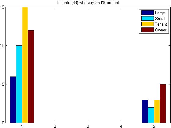
Having spent the entire week polishing our map, we now have two maps, a combination of which will likely become our final mapping deliverable. The first map we made is a continuation of the map we began last week, overlaying soft story locations with parcel information. In addition to this information we also brought in the vulnerability data from ABAG, creating a grayscale gradient spread over the entire map. Finally, we were able to to find a street map of the City of Oakland that was put underneath the soft-story and vulnerability graphics, enabling us to hide the parcel data. This made the map look much more clean and intuitive, as parcel data includes less intuitive visual information for understanding location (street names, color-coding by land use) and many more simple black lines outlining properties, which overloads the eyes with excess information without giving any real reference. Our second map was created using arcScene, which enabled us to create a map in 3D. We decided to tie the height of the properties to number of units, after discovering that a few information sets detailing the number of stories seemed inaccurate for some locations when compared to street-view pictures of the apartment. Additionally, we overlayed that information with parcel and vulnerability data. Unfortunately, arcScene was not compatible with our street map, making this map slightly harder to read than our 2D one even while containing more relevant information. To solve this problem we plan to include a small 2D map of the region our 3D map is representing as reference. Currently we plan on creating about 4 different 3D/2D maps showcases various regions in Oakland so that policy makers and planners working with the City can see the density of soft story sites in addition to the vulnerability associated with each area. Observations/Insights Last week, we made initial attempts to extract information from available results of the survey being carried City of Oakland. Those results were not much different from the City’s broad summary of statistics, so we tried to come up with more specific questions that included several of the aspects captured by the survey. For instance, we wanted to know what factors were relevant to tenants and owners (separately) for prioritization of buildings in the soft-story retrofit program, in addition to disaggregating responses by the percentage of income spent on rent. From the many results obtained from combining these multiple criteria, we found a few interesting cases, such as the one in the figure below, showing what level of priority (1 being the highest priority, and 5, the lowest) is given to large buildings (dark blue), small buildings (light blue), buildings with low-income tenants (yellow), and buildings with low-income owners (red). The key observation is how a considerable amount of tenants who pay more than 50% of income on rent thought that it was reasonable to prioritize buildings with low-income owners, raising questions such as: are they aware of the current cost-sharing structure for improvements (70% tenant and 30% owner)? This and other questions are being analyzed to be included in our final report in order to bring new elements to the policy-related discussions being held by the City of Oakland, as well as providing feedback for further outreach activities to be implemented. Next Steps With SquareSpace, we are hoping to create an approachable forum for discussion and resources. Although many documents we have created are designed for use by planners, we plan to have dedicated tenant and homeowner tabs detailing the essentials of retrofitting with social media integration. With our presentation, we hope to bring together some of our most major contributions and understand how our individual contributions might be linked. So far, we believe that our work has covered a wide variety of the Oakland Retrofit work, from community outreach to technical models of seismic damage. In the final week, we hope to simplify and condense our current GIS maps for ease of use. The initial 2-dimensional GIS map will be a overlayed heat map, the fully zoomed out view of Oakland. 3 additional maps will focus on specific regions of this master map, zoomed in for a more detailed view of the soft-story homes in the area. Thus far, these 3 regions have been designated as: 1) the area around Lake Merritt, which has a high concentration of soft story homes, 2) The eastern portion of the city, which has few soft stories but covers a large portion of the map, 3) Regions of exceptionally high risk, located further away from Lake Meritt. With our 3D GIS map, we have opted to focus on the number of units. Thus the soft story structures that contain the most units are projected are extruded to quite a height. That way, city planners can, hopefully, with one glance, see not only which areas are most at-risk and concentrated, but also which specific locations should be emphasized when choosing where to allocate public funds. Comments are closed.
|
Archives
November 2020
Categories
All
|
 RSS Feed
